
On the Grid: 4 Symbols
So far in this series, we’ve covered what our ‘map’ tells us, and how to read its directions, and we’ve also talked about the regions on the map - the colours, what they represent and how they can interact together…
But what about the data that we plot onto the map? What are the Grid symbols and what can they reveal to us?
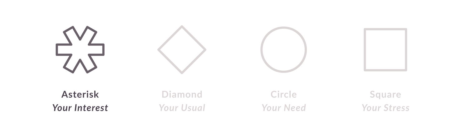
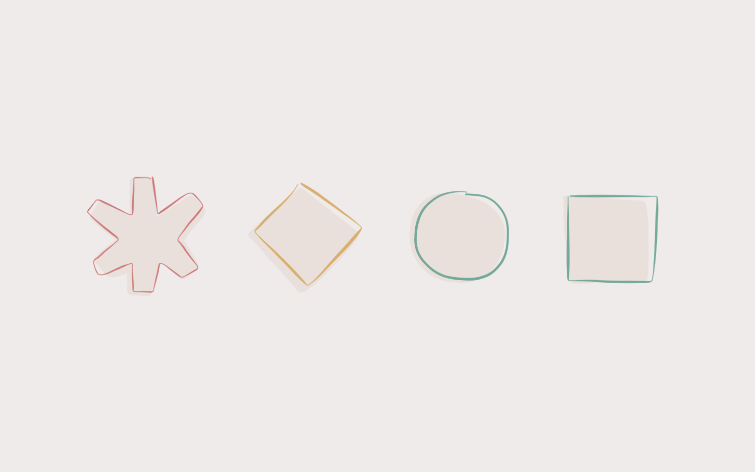
It makes sense to start with the Asterisk - partly because it’s the first symbol covered in every version of the report that you might be using, but also because it’s the only marker on the Grid which represents Motivational data.
(We’ll get into that more another time, but for now you just need to know that when we talk about the Asterisk we’re talking about Motivation, and when we talk about the other symbols we’re talking about Behaviour - and Perspective.)
The Asterisk is actually directly linked to your Areas of Interest scores - simply put, it is a summary or ‘average’ of those scores, plotted onto the Grid to help you visualise the overarching area that you’re likely to be drawn to.
If you remember the regions we looked at in Part 1 of this series, you’ll recall that there were four words linked to the four colours:
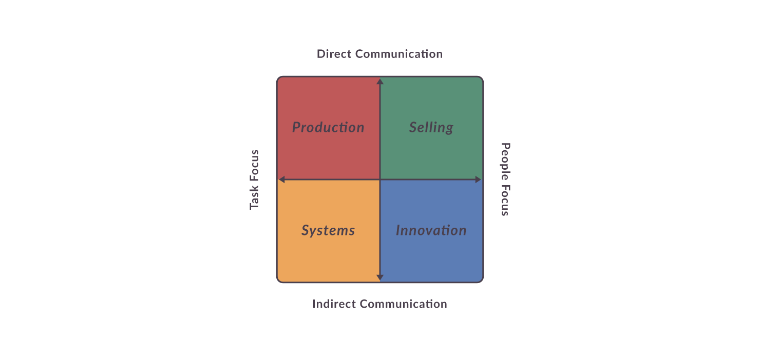
If your highest Interests are Yellow then we’d expect to see your Asterisk in that region, and it would tell us that, overall, you’re drawn to the kinds of activities that involve Systems (other words linked to Yellow include: Administration, Order, Organisation, Process and Scheduling).
If your highest Interests are all Blue and Green then we’d expect to see your Asterisk on the right-hand side of the Grid, and it would tell us that, overall, you’re drawn to the kinds of activities that involve Innovation and Selling (in other words, you’re likely to want to be involved with people, and envisaging a better future that you can inspire others with).
If you have very high Interests from each of the four colours, we’d expect to see your Asterisk somewhere near the centre of the Grid - and this tells us something too: that, overall, you can be motivated by a wide range of different kinds of activities, and that you may have greater flexibility than others around you, when it comes to handling varied tasks.
Take a look at your own Asterisk: what does it tell you about the overall kinds of activities you’re likely to be drawn to?
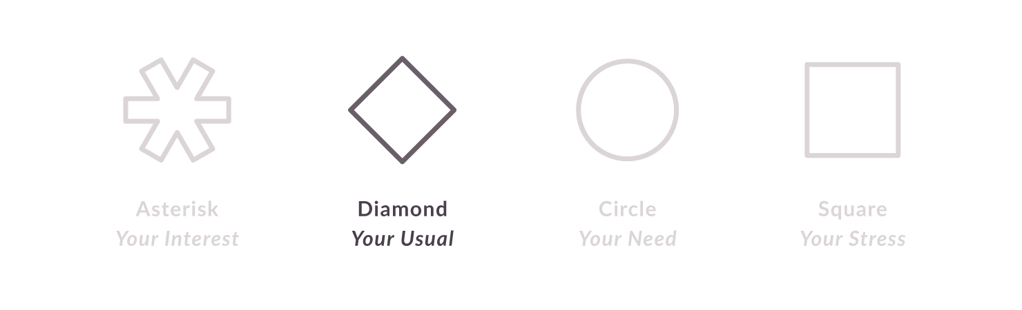
Next up: the Diamond - this is your Usual marker, and it represents the behaviour you are likely to display when things are going well for you. It’s how you expect yourself to behave, and it’s what other people tend to see when you’re not under stress.
Take a look at your own Diamond on the Grid: remembering the dimensions outlined earlier in this series (you can also refer to the Grid diagram above) what can you discern about your own Usual Behaviour? Are you top of the Grid or at the bottom? On the left or the right? Slap bang in the middle? What does this tell you?
We’ll come back to the Diamond in a moment, but first we’re going to talk about the final two symbols.
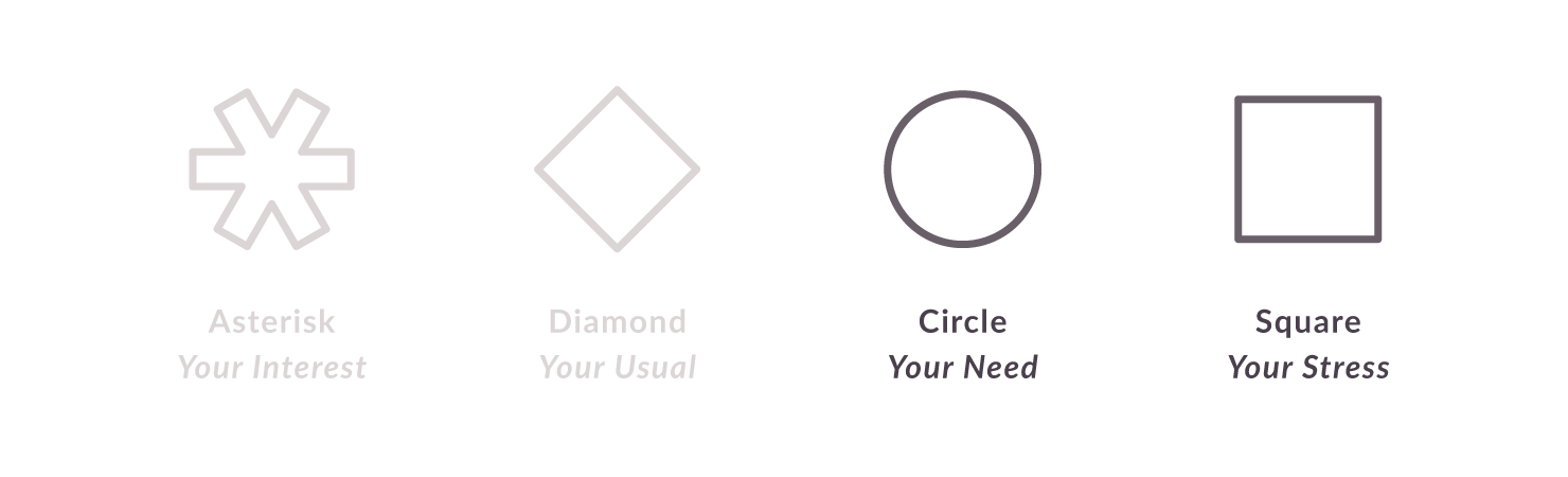
The Circle and Square are superimposed, so if you’re looking at your own Grid and only seeing 3 symbols and not 4 don’t worry! The 3rd and 4th symbols are always placed together on the Grid, and they represent Need and Stress.
I won’t go into why they are placed together, or the details of which scores these symbols are based on (if you’re using Signature you already have access to those scores, which our lighter reports do not include), but for most people, most of the time this double-marker gives a very accurate summary of the environment and behaviour you Need from others, and the outcome or Stress reaction that will occur if that Need is not met.
To give you an example, someone with their Need / Stress markers in the far Green corner of the Grid, Needs to be in an enthusiastic and engaging environment, where others are open and outgoing, there’s frequent opportunities to prove themselves and get involved in new tasks and projects, and people communicate with each other honestly, directly and without unnecessary ‘mincing’ of words.
If that Need is not met, that extremely Green person is likely to become overly direct, and may start making provocative or pointed comments to others. They may become self-promotional in an effort to exhort feedback on their performance, and self-distracting to compensate for lack of variety and stimulation…
To top it all off they might not even realise they’re doing it! Stress behaviour, though deeply seated and (once you have access to Birkman data) highly predictable, tends to be a sub-conscious reaction when things around us start feeling out of control or uncomfortable.
An environment that does not meet your intrinsic Needs (of whichever colour) can feel stifling, overwhelming or just downright insane. You might find yourself looking around you, and wondering how no one else seems bothered…?? Chances are their Needs are being met by the environment, even if yours aren’t.
Have a look at your own Need / Stress markers: based on what you know about the Grid and the 4 colours (and using your report if you get stuck) write yourself a summary of - a) the kind of environment you Need and b) the kind of Stress behaviour that might show up if that Need is not met. Do you recognise any of those Stress reactions in your own behaviour over recent weeks? If yes, what might that tell you? Can you recognise what aspect of your environment might be triggering those reactions?
Let’s go back to your Diamond (Usual) marker for a moment.
You’ll have noticed that in the example of Green Need and Stress I gave, that the Stress reactions were almost identical to the environmental Needs I described. The only difference was that while the environment was positive, the Stress reactions were very clearly negative.
The same goes for Usual and Stress - because, while Usual behaviour helps to create a positive environment (at least for people with that Need colour), Stress behaviour rarely has great outcomes.
What that means is that none of the colours are intrinsically good or bad - you can have positive Red Usual behaviour, or negative Red Stress behaviour. Same with Green, same with Blue, same with Yellow. The Stress version of each colour is a distortion of what that same behaviour would look like if it were ‘Usual’.
For example - Red Usual looks like a person who is direct and straight-forward, friendly and active, and focused on making sure things get done. Red Stress looks like a person who is blunt and insensitive, impatient with people and busy for its own sake. Can you see how Red Stress is a distorted and unhelpful version of Red Usual?
The final thing worth mentioning is this: for most people their Usual behaviour is going to be at least somewhat different from their Need / Stress. The further your Usual (Diamond) marker is from your Need (Circle), the more likely people are to completely misread your preferred environment or Need.
In other words, if Usual is the behaviour that others see most of the time (assuming you are not stressed ‘most of the time’), that is likely to be their whole picture of you: how you act and how you’d like others to act.
After all, aren’t we all told to ‘treat others the way we ourselves would like to be treated’?
If we assume that a person who is direct and straightforward in the way they communicate, wants others to treat them the same way, we will a) be direct and straightforward back to them and b) quite often be misreading them completely.
The same is true if we assume everyone who is careful and diplomatic in the way they communicate, wants others to be careful and diplomatic towards them in return. You’ll drive some people mad treating them the way they treat others! Some careful, diplomatic people are desperate for others to just say it like it is! (Don’t believe me? I’m one of them…)
You can have any combination of Usual and Need scores, so there is no way for us to deduce how a person wants to be treated based on how they themselves normally behave. Some people will have the same colour Usual and Need, but plenty of others will have completely opposite colours for each - you just can’t guess: which is why we use this data in the first place!
Take a look at the distance between your own Diamond and Circle markers: are they close together, a little distant, or on opposite sides of the Grid? What does this tell you, and how can you manage any potential misreading of your Need?