

On the Grid: Map Reading
The Grid - also known as Your Birkman Map if you’re using Signature - is a visual summary of 4 big chunks of your data. It may look simplistic on first glance, but there’s actually a lot of information you can get out of it… provided you know what you’re looking at.
Before worrying about the symbols and what they represent, it’s vital to get a clear understanding of how to read the Grid itself. As I said before, the Grid is also known as a Map, and there’s a very good reason for that.
Basic Map Reading
As you know, on a regular map there are four directions: North, South, East and West. Similarly, on the Grid there are four dimensions:
- ‘North’ - Direct Communication / Active
- ‘South’ - Indirect Communication / Reflective
- ‘East’ - People Focus / Subjective
- ‘West’ - Task Focus / Objective
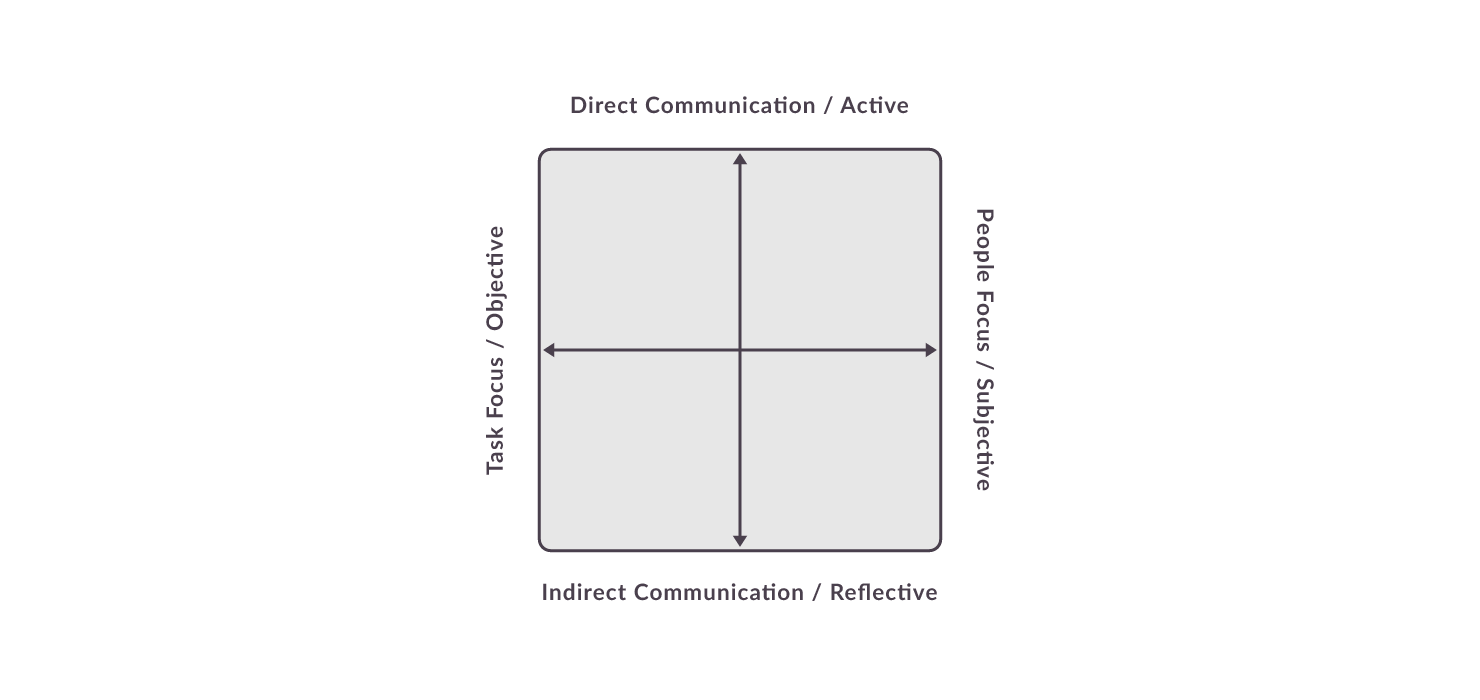
In other words: the higher up the Grid, the more Direct a person is; the lower down the Grid, the more Indirect a person is. The farther to the left, the more Task Focused a person is; the farther to the right, the more People Focused a person is.
Pretty simple, right?
Regional Summaries
The second thing you need to know is that, similar to a regular map, the Grid has regions - represented by the four colours.
That means that just as you could say something was in the ‘North-East’, the data might identify a person as being Direct and People Focused, and you’d know that those qualities would place them somewhere in the Green ‘region’.
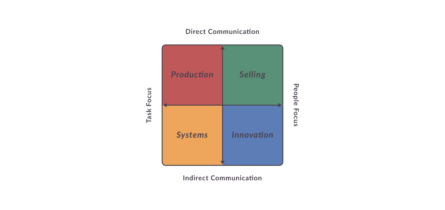
As you can see on the Grid itself, those regions are as follows:
- ‘North-West’ = Direct Communication + Task Focus = Red (Production)
- ‘North-East’ = Direct Communication + People Focus = Green (Selling)
- ‘South-East’ = Indirect Communication + People Focus = Blue (Innovation)
- ‘South-West’ = Indirect Communication + Task Focus = Yellow (Systems)
That being said, it’s important to note that these regions are not a collection of ‘buckets’…
X Marks the Spot
Just as you can use coordinates to pinpoint an exact location on a map, each of your markers is positioned based on exact coordinates relating to your raw data.
That means your markers can fall anywhere on the Grid - right in the very centre, firmly in Yellow, on the border between Green and Blue… anywhere!
Which means that we sometimes need to combine those ‘regional summaries’ to get an accurate picture.
For example, let’s say that you did fall on the border between Green and Blue, but just slightly more Green than Blue. Your marker would appear Green, which would imply Direct Communication + People Focus.
However because you are actually mid-way down the vertical axis, a more accurate description would be A balanced approach to communication (neither Direct nor Indirect) + People Focus.
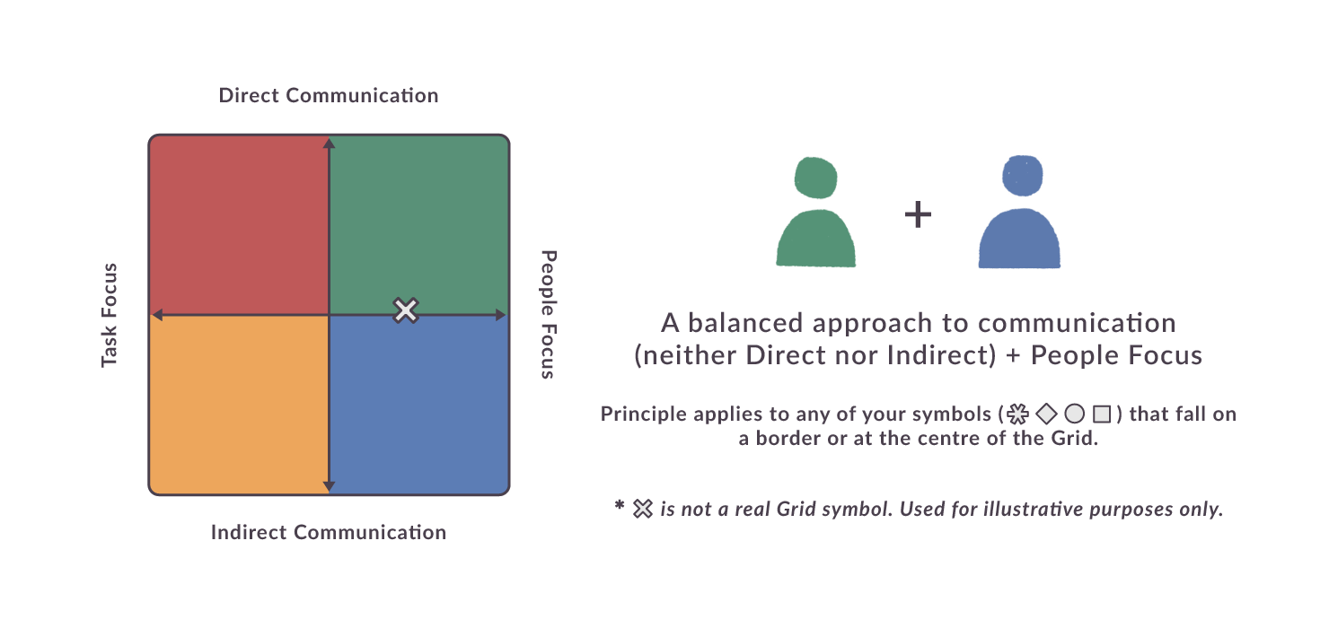
The point I’m making is that not all ‘Greens’ are equally, typically Green. And the same applies to each of the other colours too.
This data is not ‘one-size-fits-all’ - it’s specific and fine-grained - and even the Grid (summarised as it is) reflects that.