Understanding Interest: Reading your Asterisk on the Grid
If you’ve been using hoozyu for a while, you should be fairly familiar with both your 10 Interest scores, and your Asterisk symbol on the Grid.
In case it never clicked for you, your Asterisk on the Grid marks the ‘average’ of your 10 Interest scores.
You’ll have noticed that the Interests are colour-coded and that, for most people, the Asterisk falls within the same colour as their highest Interests. This is clearest for people whose highest Interest scores are all the same colour. For example, if you have a block of all Blue highest Interests, then your Asterisk is likely to also be very clearly in the blue quadrant.
If, on the other hand, your 4 highest scores are reasonably close together (numerically) but are each a different colour, you would expect your Asterisk to fall near the middle of the Grid.
It’s simple enough, and for most people there is unlikely to be any confusion. What they see in terms of their Asterisk is likely to be a fairly accurate indication of their individual Interest scores.
But for a few of us, looking only at the Asterisk could be a little misleading…
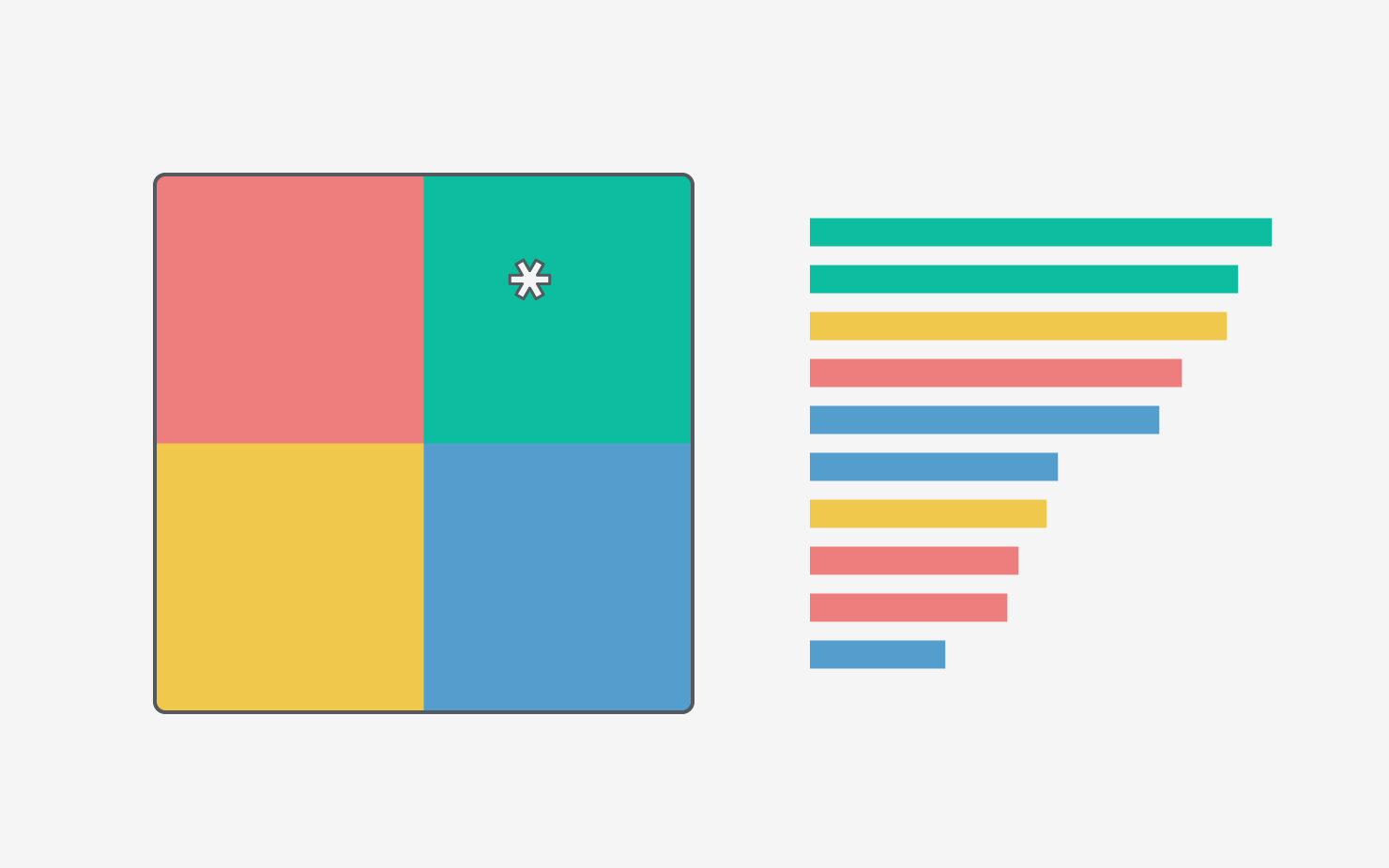
For example, this is what my Asterisk looks like:

In the description to the right of the Grid, on my Summary Report, my Asterisk is labelled as being Blue.
Judging from these 2 pieces of information you might make a guess about my Interests and assume the following: Highest score (or scores) are Blue, followed by Yellow, but with enough Red and Green scores in the mid-range that the Asterisk is pulled toward the centre of the Grid.
And that would be a fair guess, given the circumstances - but it’s only partly correct.
In reality my top 6 Interest scores go like this: Blue, Red, Blue, Red, Blue, Red. Based on that you might expect my Asterisk to fall near the very centre of the Grid, just slightly closer to Blue than to Red.
So then, why does it appear to be on the edge of Yellow?
Well, my Yellow Interests are not high scores, but they are only in the mid-low range… my Green Interests on the other hand both fall within the very low range!
Can you start to see why my Asterisk is positioned where it is? In fact, it’s position on the edge of Yellow has less to do with being drawn toward Yellow, and much more to do with being pushed away from Green!
So, why does this matter? Well, if I didn’t look to the individual scores as a reference, it would be really easy to misread what the Grid is telling me about the overall kinds of activity I am likely to find motivating.
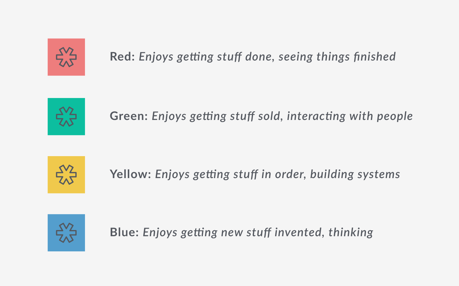
I might pick up the Blue: Enjoys getting new stuff invented, thinking.
But instead of Red (Enjoys getting stuff done, seeing things finished.) I would be looking at Yellow (Enjoys getting stuff in order, building systems.) and might miss out on the practical activity aspect - which really matters to me!
Activity:
Take a look at your own Asterisk on the Grid - how would you read it’s position?
Check this against your itemised Interest scores - do they correlate clearly? Or is there potential for misreading?
If you have a print-out of your Summary Report, that you keep on a noticeboard or stuck to the fridge door, add a little note to yourself to remind you of what your Asterisk is really saying.
The Asterisk is a really useful summary for indicating the type (or types) of activity (Production / Selling / Innovation / Administration) you are likely to find most energising - but it only works if you are able to read it’s position accurately!
If you’re like me and all your highest Interests fall across a diagonal on the Grid (i.e. all Red & Blue, or all Yellow & Green) check out our post about the Diagonal Axes on the Grid.